
The Art of Architectural Analysis: Utilization, Throughput, Latency
Putting TinyXPU Under the Microscope


Disclaimer: Opinions shared in this, and all my posts are mine, and mine alone. They do not reflect the views of my employer(s) and are not investment advice.
In this post, we introduce the art of architectural analysis through three key concepts and use them to evaluate the TinyXPU architecture - a systolic array based 2D matrix multiplication accelerator we designed to study the evolving trends in custom silicon. The ability to analyze architectures is becoming an increasingly valuable skill - especially in a world of rapidly growing custom architectures. So, whether you’re a software or hardware engineer, you will benefit from reading about these concepts.
If you are new here, this post is part of our ongoing series on custom accelerators. In the first part of this series, we motivated the need for a bridge between a software engineer (Alice) to a new architecture developed by a hardware engineer (Harry).

In the second part, we introduced our TinyXPU project - a practical demonstration of the hardware-software bridge.

While we recommend reading the first two parts, it’s not a prerequisite as this post takes a slightly different direction.
Why does Architectural Analysis matter?
So far, we’ve focused on how Alice and Harry can work together more effectively. Using a framework like ONNX, we showed that Alice can now target many different architectures (and many different Harrys) with relative ease.
This naturally leads to the next question: How does Alice decide which Harry to choose?
At first glance, the answer seems simple: Alice would pick the “best architecture” for her algorithm. But what does “best” actually mean?
From Alice’s perspective, it could mean:
I want my algorithm to finish faster
I want to start seeing outputs as early as possible
I want it to fit within a smartwatch, a robot, or a datacenter
From Harry’s perspective, the architecture might be “best” because:
It reduces the number of arithmetic operations or data movement
It runs at a higher clock frequency than competitors
It occupies less chip area than other implementations
Clearly, Alice and Harry are both trying to communicate. But they are speaking completely different languages. If Harry wants to convince Alice to use his architecture, and Alice wants to make the right choice, they need a shared vocabulary for analyzing architectures. This is where understanding concepts in architectural analysis becomes important.
The Cooking Analogy
To build intuition for the ideas in this post, we’ll use a simple analogy: cooking.
More specifically:
The Algorithm: Boiling eggs
The Hardware: A kitchen stove
Boiling eggs is simple, but it can be done in many different ways.
You might cook eggs one at a time or in batches. You might prioritize getting the first egg ready as quickly as possible or finishing all of them as fast as you can.
Similarly, each stove is different. One might have more burners. Another might heat up faster. A third might support a larger pot but heats up slower.
This is not too different from the problem Alice and Harry are trying to solve.
For clarity, all future references to this analogy are displayed as quotes.
Recap: The TinyXPU Terminology
We briefly introduced the parameters used in the TinyXPU project and the matrix sizes in part 2 of our series of posts. Here’s a quick recap of variables that will be used in the rest of the post.
The Input Matrix X has M rows and K columns.
The Weight Matrix W has K rows and N columns.
The PEs are arranged as a 2D array with HW_ROWS rows and HW_COLS columns. In this post, we will only explore the 16*16 configuration.
Concept 1: Hardware Utilization
Quick Takes
What is it?
How much of the hardware is being used to produce useful output.
In our cooking analogy, if your kitchen stove has 4 burners but you only use 3 simultaneously, the utilization is 75%.
Why does it matter?
High utilization means more of the hardware is active at the same time. In general, this implies that more sub-operations (additions, multiplications, data movement) are happening in parallel.
If more burners on your stove are on, it means more eggs are being boiled.
When does it not matter as much?
In general-purpose architectures like CPUs and GPUs, the hardware is almost never fully utilized. In these systems, overall utilization matters less than the utilization of specific components (such as ALUs).
However, an accelerator is designed for a very specific purpose. It is therefore wasteful to build hardware that cannot be effectively utilized. In most accelerators, high utilization is close to a non-negotiable.
Having low utilization is like using a 4-burner stove when you only need to boil one egg.
PE Utilization in TinyXPU
In TinyXPU, the size of the systolic array is fixed in hardware (16×16 in our case), but the matrices we run on it are not. This mismatch is the primary reason utilization becomes an important metric.
The goal is simple: keep as many PEs busy as possible for as long as possible.
In our cooking analogy, this is equivalent to keeping all burners active. If you only have enough eggs for two burners, the remaining burners sit idle, even though the stove could do more work.
Where does underutilization come from?
1. When the workload is smaller than the array
If the weight matrix is smaller than the systolic array, for example fewer than 16 rows or columns, some PEs will not map to useful computation. To maintain correctness, we typically pad the matrix with zeros. These PEs still perform MAC operations, but their outputs are discarded.
This is like turning on burners with empty pots. Heat is being generated, but no eggs are being cooked.
2. When the workload is larger than the array
If the matrix is larger than the array, we process it in tiles. While tiling allows us to handle arbitrarily large matrices, the last tile is often smaller than the array, leading again to underutilization. We will skip the details of tiling in this post, but this edge effect is quite common in practice.
Startup overhead: why utilization is not 100%
Even when the workload maps perfectly to the array, utilization is not immediately 100%. This is because not all cycles contribute to useful work. At the start of execution, the systolic array needs a few cycles before all PEs begin performing meaningful computations. Similarly, toward the end, some PEs become idle as the computation completes.
From a utilization perspective, these cycles are overhead. The hardware is active, but not all of it is doing useful work.
Before you can boil eggs, you need to fill the pot and wait for the water to heat up. During this time, the stove is on, but no eggs are being cooked.
Considering this overhead, we define utilization as:
This shows that utilization improves as the workload grows, because the fixed overhead is amortized over more useful work.
PE Utilization vs Batch Size
The impact of matrix sizes on PE utilization is shown in this plot:
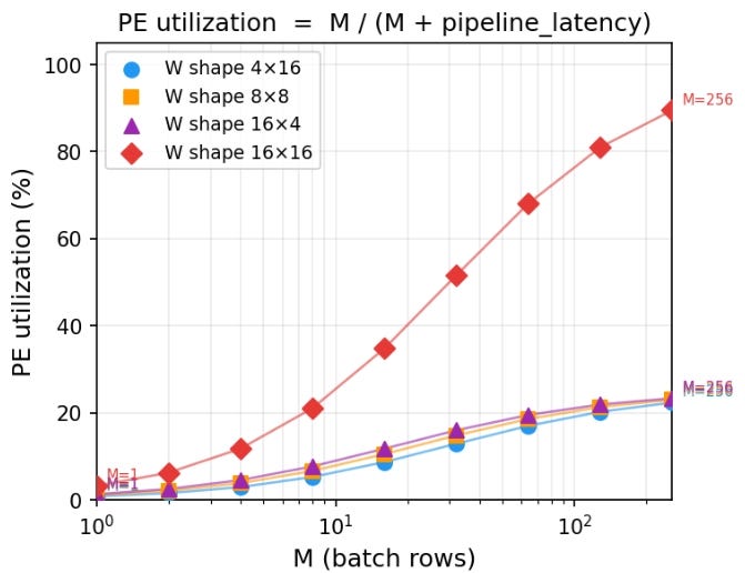
Key takeaways:
The 16×16 case asymptotically approaches 100% utilization, as the pipeline overhead becomes negligible compared to useful work.
The other shapes (4×16, 8×8, 16×4) all have 64 total weights, and therefore can only utilize 64 out of 256 PEs, which corresponds to a maximum of 25% utilization.
For small values of M, utilization is low across all configurations due to pipeline overhead.
As M increases, all curves improve, but they plateau at different levels depending on how well the workload matches the hardware.
Utilization is a useful analytical metric. It tells us how much of the hardware is actively doing useful work and highlights inefficiencies due to pipeline overhead.
How architects use this metric in real chips
In real chips, utilization is rarely exposed as a single number. Instead, architects infer it using performance counters, stall analysis, and activity factors across compute units. A classic example is the TPU v1 paper, where the authors show that achieving high utilization of the 256×256 systolic array was critical to performance. They analyze how different workloads map to the array and highlight cases where underutilization leads to significant efficiency loss.
Concept 2: Throughput
Quick Takes
What is it?
The number of useful operations completed per unit time.
In our cooking analogy, this is the number of eggs you can boil per hour.
Why does it matter?
Throughput directly determines how fast an algorithm completes. If more operations are finished per unit time, the total execution time is lower.
When does it not matter as much?
In many systems, overall throughput is limited by the slowest component. Even if one part of the system achieves very high throughput, it may not translate into end-to-end performance improvements.
Custom accelerators are typically designed to maximize throughput. However, understanding what limits that throughput is just as important.
From Throughput to the Roofline Model
So far, we have treated throughput as a single number. In reality, it is constrained by two fundamental limits:
How fast the hardware can compute
How fast data can be moved to and from the hardware
The roofline model captures both of these limits in a single diagram, which is why it is a better representation of our throughput analysis.
In our cooking analogy, the number of eggs you can boil per hour is not just determined by how many burners your stove has. It is also limited by how quickly you can bring water, eggs, and utensils to the stove. If you have many burners but can only carry a few eggs at a time, most burners will sit idle. On the other hand, if you can supply eggs very quickly but only have a small stove, the burners themselves become the bottleneck.
TinyXPU Roofline Model
Vertical Axis: Peak Throughput
For a systolic array, if the workload fully utilizes the array, the peak compute throughput is:
For our 16×16 array, this gives a peak of 256 MACs per cycle. However, if the weight matrix is smaller than the array, only K×N PEs perform useful work. This represents the vertical axis of our roofline model.
Horizontal Axis: Arithmetic intensity
Arithmetic intensity is the number of MACs executed for each byte of data read from the memory. For our matrix multiplication example:
Weights are loaded once: K×N bytes (we ignore this as batch size is usually large)
Inputs contribute: M×K bytes
Outputs contribute M×N values, each 4 bytes (we assume output values are 32-bit integers)
This gives:
So, the arithmetic intensity (AI) becomes:
Roofline Plot
Based on the definitions above, the roofline plot for TinyXPU is shown here:
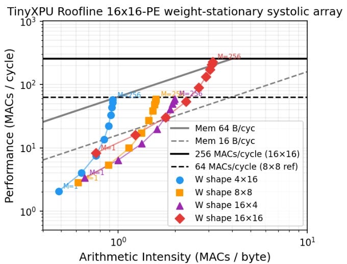
Each point on the plot represents a specific workload running on the hardware. The horizontal axis is arithmetic intensity and the peak throughput. The roofline plot also includes two lines which are important:
The horizontal line represents the peak compute capability of the hardware
The sloped lines represent memory bandwidth limits
Several insights emerge from this single diagram:
If the weight matrix is smaller than the array, peak compute throughput cannot be reached due to underutilization (this aligns with our earlier analysis on PE utilization.)
Among shapes with the same number of weights, taller matrices perform better than wider ones. This happens for two reasons:
Idle rows waste more hardware than idle columns
Output traffic scales with N, and outputs are larger in size
The 4×16 shape is more bandwidth-limited than 16×4, since it produces more output data
Most configurations in this example are memory-bound unless bandwidth exceeds 64 bytes per cycle (which is rare in CPU L1 caches as seen from this post on min{power})
Using a roofline plot, it becomes clear how throughput can be maximized:
Move upward by increasing compute efficiency (Larger batch sizes)
Move right by increasing arithmetic intensity (Taller matrices)
By being in the top right, we get the best throughput.
How architects use this metric in real chips
The roofline model is one of the most widely used tools for reasoning about throughput limits. Modern accelerators frequently use roofline-style analysis. For example, NVIDIA presents roofline-inspired performance characterizations in its architecture whitepapers, (For example, NVIDIA A100 Architecture) where compute throughput and memory bandwidth limits are analyzed together.
In fact, the roofline plot we obtained for TinyXPU is not too different from the plot shared in the TPU v1 paper:
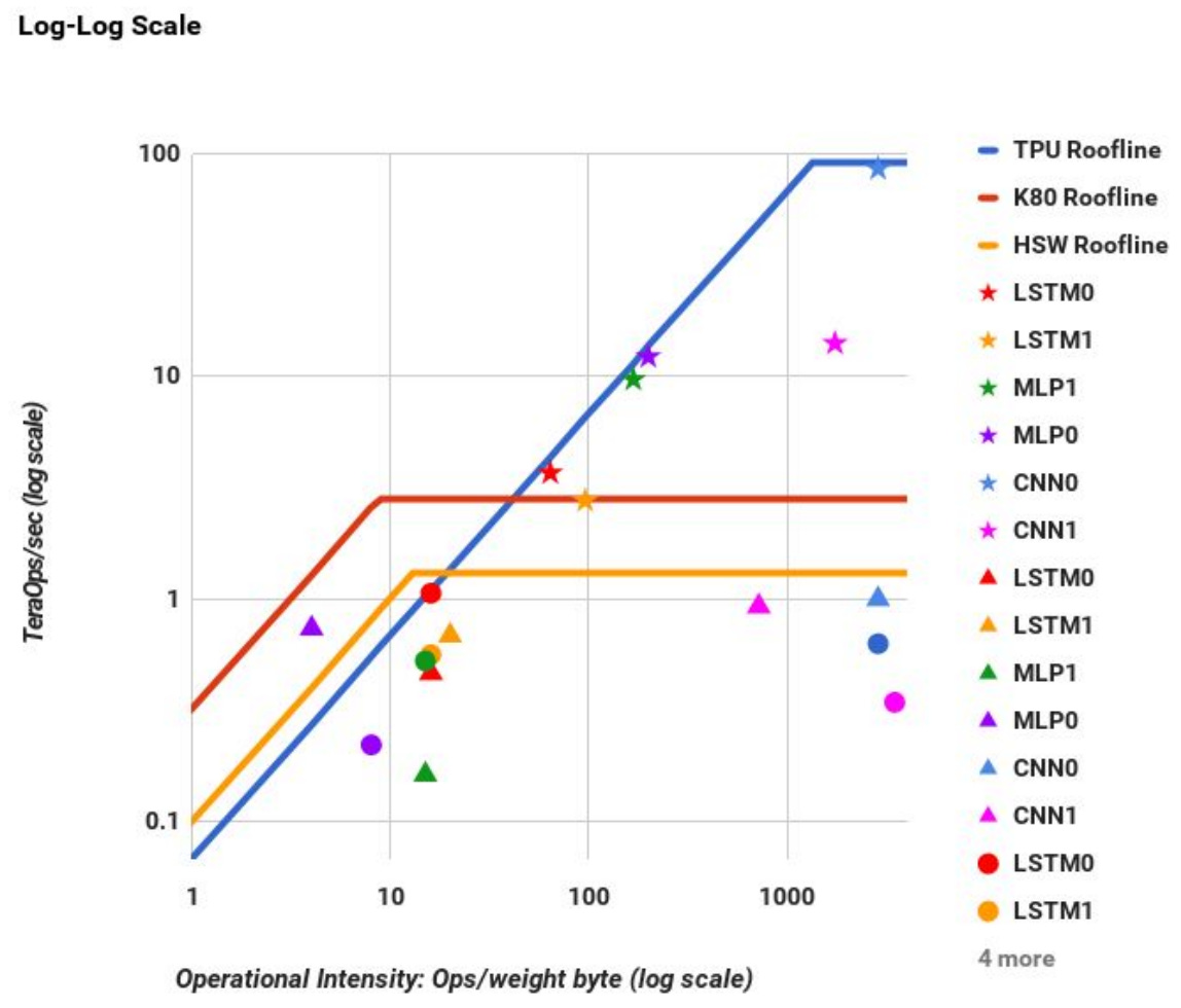
Source: https://arxiv.org/pdf/1704.04760
Concept 3: Latency
Quick Takes
What is it?
Latency is the time it takes to produce the first useful output after the first input is provided.
In our cooking analogy, this is the time between turning on the stove and having the first boiled egg ready.
Why does it matter?
Latency matters when partial results are useful before the entire computation is complete. For example, modern LLM-based systems stream outputs token by token. As soon as the first token is ready, it is displayed to the user. In such systems, latency directly impacts user experience.
When does it not matter?
Latency matters less when the full output is required before any further computation can proceed. For example, in a classification task such as predicting whether an image contains a cat or a dog, the final decision can only be made after all computations are complete. In such cases, throughput is often the more relevant metric.
Latency in TinyXPU
To analyze latency, we first need to define what we mean by the “first output.” In matrix multiplication, we define the first output as the result corresponding to the first row of the input matrix X.
For readers familiar with LLMs, consider the computation of the query matrix:
Each row of X corresponds to the embedding of an input token. The first row of Q therefore corresponds to the first token. The time taken to produce this row is a key component of time to first token (TTFT).
Where does latency come from?
Even if the input matrix X has many rows, the first result that emerges from the systolic array corresponds to the first row. This delay is caused by the time it takes for data to propagate through the array.
In the cooking analogy, this is like the time it takes to heat the water and cook the first egg. Even if you plan to cook many eggs, the first one still takes the same amount of time.
For a weight-stationary systolic array, the latency to first output is:
Essentially, the latency only depends on the number of rows in the hardware array and the number of output columns. It is independent of the batch size M.
Throughput vs Latency Tradeoff
The plot below shows throughput on the vertical axis and latency on the horizontal axis for different matrix shapes. Each curve corresponds to a fixed number of rows K, while varying the number of columns N. The batch size (M) is fixed to 256.
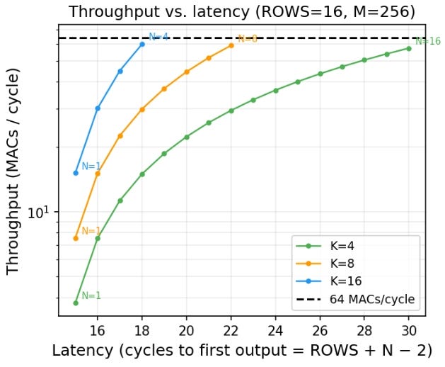
This plot clearly shows the inherent tradeoff between throughput and latency.
Increasing N increases throughput, since more PEs are active
However, increasing N also increases latency
This means designs with the same total compute capacity (total number of PEs) can have very different latency and throughput characteristics. If you want fast response to the first output, you prefer smaller matrices with lower latency. If you want higher overall throughput, you prefer larger matrices that utilize more of the hardware.
In the cooking analogy, this is like choosing between boiling one egg quickly or boiling many eggs at once. Using a larger pot allows you to cook more eggs simultaneously, but it may take longer before the first one is ready.
This throughput-latency tradeoffs starts to become even more interesting in accelerator designs with pipelined PEs to achieve higher clock frequencies, and full-system implementations with non-zero instruction and memory latencies - topics we will explore in future posts.
How architects use this metric in real chips
Latency is typically modeled using a combination of analytical models and cycle-accurate simulations that capture pipeline depth and data movement delays. For example, Google discusses latency-sensitive inference in the MLPerf Inference Benchmark, which includes metrics like time-to-first-token and tail latency.
As you can see from the discussion, architectural analysis is as much art as it is science. It’s more like appreciating a painting than reading a book. An experienced art connoisseur can analyze a painting at a glance. But that ability comes from a shared understanding of color, brushwork, and design principles between the artist and the observer.
This post aims to build a mental model for architectural analysis, using our basic TinyXPU implementation as a concrete example. As we continue to expand TinyXPU by adding activation functions, mapping it to an FPGA, and exploring unorthodox systolic networks, we’ll build on these ideas and introduce new ones along the way.
Subscribe to Chip Insights and min{power} to follow along as we do that.
 | A guest post by
|